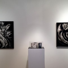
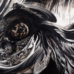
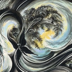
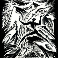
It is great to be back again for my third solo exhibition near my hometown of Chicago where I grew up north of the city on my Grandfather’s tree nursery. I created this body of work over the past three years and the largest painting, “Sacrifice I” I worked on and off since 2009. … Continue reading “Avance” @ Firecat Projects : Artist talk : Friday, Sept 18 @ 7pm
Category: News
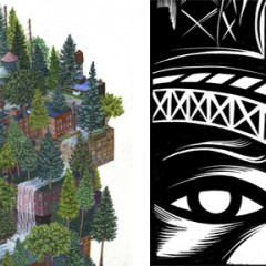
Juxtapoz Magazine : “Avance” @ Firecat Projects : Chicago : Through Sept 19, 2015
I received a nice feature on Juxtapoz magazines blog for my current show in Chicago at Firecat Projects. Thank you again Juxtapoz magazine, one of the largest circulating art magazines in the world, for your ongoing support!
Mural commission Chapter 24 Vineyards, OR
Just back from OR + got the full experience of my mural! Thank you Chapter 24 Vineyards who make the wonderful pinot noir wines : FIRE + FLOOD Thank you Wine Enthusiast for the nice mention : “Your Wine and Fine Art Fixes” “The tasting room is the permanent home to artist Cathie Bleck’s evocative “Infusion:… Continue reading Mural commission Chapter 24 Vineyards, OR
New US postage : Fanciful Flowers Stamp
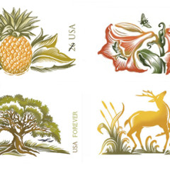
I am honored that my forth postage stamp, the lily was released this summer. I think this may be my favorite because of the vibrancy of the colors and composition and it was inspired by my love for my garden. It also speaks to the spirit of new life and transformation! You can find out… Continue reading New US postage : Fanciful Flowers Stamp
October 11th 6-9pm :: “Rarely Home” + Craft Beer Event
by Peggy Roalf Thank you DART newsletter for the shout out on this weekends event : last week to see our show! DART Subscribers in the news: Otober 11, 6-9 pm Join Cathie Bleck and fellow artist Amy Casey for an artist’s reception and party to celebrate their dual exhibition, Rarely Home. This is also… Continue reading October 11th 6-9pm :: “Rarely Home” + Craft Beer Event
“Rarely Home” : Cleveland @ Maria Neil Art Project : Cathie Bleck + Amy Casey
I recently opened a new exhibition called “Rarely Home” on Sept. 5th, 2014, sharing the space with the amazing talent Amy Casey. Neither of us exhibit in Cleveland regularly but were thrilled to be part of all the excitement going on over in the New Waterloo Arts District at Maria Neil Art Project. My… Continue reading “Rarely Home” : Cleveland @ Maria Neil Art Project : Cathie Bleck + Amy Casey
U.S. Postage Stamp Release 2014 “Tree stamp”
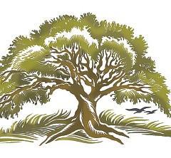
This is the second in a series of nature stamps that I have done for the U.S. Postal Service in collaboration with art director Ethel Kessler. One of my personal favorites! It comes pre-posted to a postcard. You can order them here. Have a happy summer of writing and sitting under a big tree!! Thank… Continue reading U.S. Postage Stamp Release 2014 “Tree stamp”
Small Bhutan Paper Paintings @ Packer Schopf Gallery : Chicago
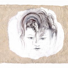
It was heartwarming to greet so many friends and family that came out to support my show at Packer Schopf Gallery in Chicago. I had an amazing time that whole week planning the artworks in the intimate space along with the masterful eye of Aron Packer. The space was perfect with the raw and… Continue reading Small Bhutan Paper Paintings @ Packer Schopf Gallery : Chicago
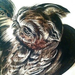
New Print Release :: Stone Lithographs
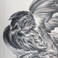
Available in a very limited Edition of 20 :: $450. Printed on Rives BFK Off White, Artist signed, numbered and stamped/chop by Master Printer, Karen Beckwith TMP Allow 1-2 weeks for shipping via Fed Ex Ground, securely packaged. PURCHASE :: “The Chamber” … Continue reading New Print Release :: Stone Lithographs
“frAGILITY” NEW works on Papyrus CHICAGO Exhibition : NOV 1 – Dec. 28, 2013
PRESS RELEASE CATHIE BLECK / frAGILITY / New works on papyrus Contact: Aron Packer 312.226.8984 PACKER SCHOPF GALLERY : 942 WEST LAKE STREET, CHICAGO, IL 60607 WWW.PACKERGALLERY.COM Event Date: Artists’ Reception: Friday, November 1st, 5-8 PM Exhibition Run: NOV 1 – DEC 28 , 2013 Cleveland artist Cathie Bleck presents a new collection… Continue reading “frAGILITY” NEW works on Papyrus CHICAGO Exhibition : NOV 1 – Dec. 28, 2013